Steinway & Sons Redesign
Over the past year I’ve had the pleasure of working with New York based piano manufacturer Steinway & Sons. They’re not just any old piano manufacturers. We’re talking pianos that take almost a year to make by hand, and retail at close to what I bought my house for. Seriously.
The whole project came together fairly smoothly, and included a variety of different mini-projects that really kept things interesting. There were some print ads, dealer site designs, and even some internal cms and crm design tweaks done. The first thing the client wanted to tackle though, was the home page.
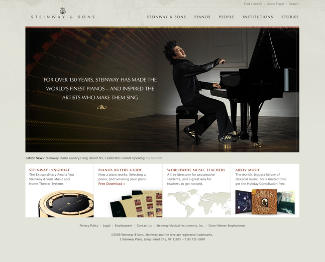
Having never worked with this client before, I wasn’t quite sure how much creative liberty I would have, so I played it safe and started off with a design that closely followed a wireframe that they provided (I can’t track down that wireframe right now, or I’d post it as well).
Along with that comp, I also showed a variation that was a little more dynamic and something I felt fit the Steinway brand a bit better.
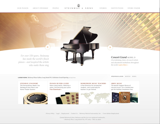
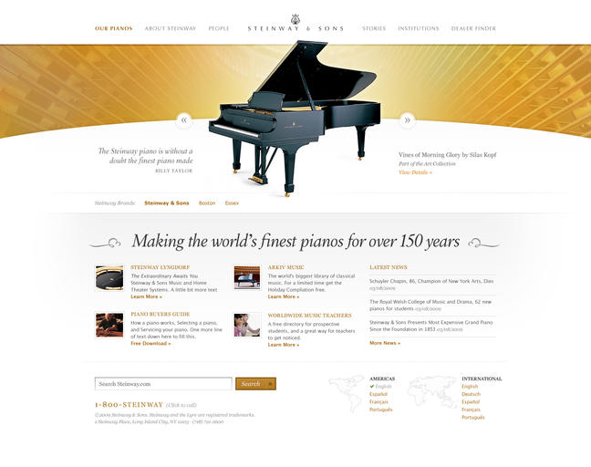
Steinway liked the second approach… and wanted to go with it. I was pretty happy with it too, but continued to refine it as I worked on the rest of the site. The first change I made was to the secondary content section.
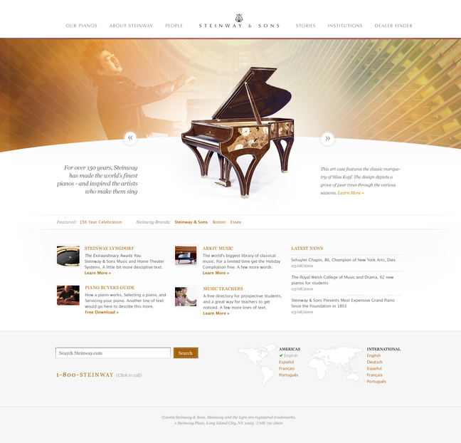
This was better, but I felt that it was still a bit too top heavy… and could be balanced a bit better. I cut the height of the background image a bit, and let the piano pop up over the top in an attempt to make it stand out more.
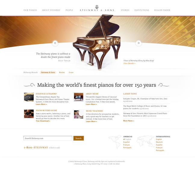
From there it was just a matter of tweaking the colours and typography to bring it all together…
Overall I’m very happy with how this project turned out. One of my personal goals for this project was to get away from relying on the same techniques that I’ve become comfortable with over the years… and it was actually harder than I thought it would be. I found myself resorting to the same button styles, shading techniques, etc… and having to force myself to go back and change things up. I figured that if these guys can spend a year making a single piano, I could probably spend an extra couple hours here and there on refining these details.
Along with the website redesign, I also had the opportunity to work on a metronome application for the iPhone. I just added that one to my portfolio today, and if you want to see some of the process on that one, you can check it out on Dribbble.
Comments
Wonderful work, again.
The quality of your designs—specifically your attention to detail—is of a quality that most of us can only hope to strive towards. Still, just attempting to approach your standard of work would make most anyone a better designer.
Every time I saw your new design I say to myself: “Shit! It`s just not fair!”.
I hope you understand me right :)
It’s a wonderful site – and I never get tired of reading whatever ‘process’ snippets you post here. Great work.
Thanks for the insight :)
I do quite like the first comp though but the second definitely sells the brand better.
What typeface did you go with for “Making the finest..”?
Was it built on EE 1.6 or 2.0?
As always – your work is just top notch. Inspiring.
Great work.
I know exactly what you mean about over using the same style (I find myself doing it) and I’m really going to try and avoid this ni my next project.
As always – fantastic work.
It’s a gorgeous piece of work. Nicely done! And congratulations on breaking out of your usual style – and coming back with something even better! I know how hard that can be.
Thanks for sharing your process in this way. I like seeing that we work very similar in the way we do our process. I agree with the direction you took them. Something though, is causing me to miss this section from an earlier comp – http://cl.ly/68f05ef30c448f48ad44 ( The grid and positioning here attracts my attention more while also very pleasing to me.)
Great work, as usual.
So did you get a piano out of the deal too? :). Wonderful looking site, as always!
Beautiful work. Congratulations Jesse.
Beautiful as always!
@ Matthew Agreed. That does look better. Unfortunately, I had to modify some of those elements for the dynamic elements of the site (some pianos are wider than others, etc)
@Nevin I wish. Actually… until this project came along, I had no desire to own a piano… but after seeing how they’re made, and the attention to detail… I appreciate them so much more.
Simply gorgeous work Jesse. I hold a degree in Violin Performance and have immense respect for the craftsmanship of the Steinway company. I am delighted to see such amazing work for an instrument maker, especially the Steinway company as it will set the standard for others.
Beautiful… bravo!
I browsed around the site a bit, and I really like how the images are overlap the drawn border line on the buyers guide.
Did you also design http://restoration.steinway.com/ ?
I hope you get the chance to redesign http://www.steinwayaccessories.com/ as well.
Thank you for sharing your work.
Redesigns are difficult. There is an expectation already established and the added complexity of this prestigious brand likely presented a lot of pressure. Wonderful job-the design mimics the craft found in the brand being featured.
Well done Jesse, love the site — especially how you have collaged part of a piano into the main header image. Top work
You did a wonderful job on this project. It’s really cool to share some parts of your design process with your readers.
This is an impressive redesign, very well managed… Your client should have been really really happy to work with such a talentuous designer like you.
Thanks for the nice comments everyone!
@Joe I didn’t do the design on the restoration site, but it was modelled after some of my comps I believe (I think it launched before the official site did).
This is really great work. Thanks for sharing, Jesse. I’m looking at the second comp and thinking “Wow! That looks great, I would have stopped there and called it a day.” But seeing how you tweaked the design and pushed it even further is really inspiring and helpful. You’ve challenged me to try to push beyond my own standard techniques and explore new and better ways of solving old problems. Thanks again for sharing.
Thanks for giving us an insight into your design process here Jesse, it’s a beautiful design.
I first came across the site and was blown away by it’s cleanliness and attention to typographic detail in particular. I had no idea you were behind the design.
Having the piano pop out over the header is a master stroke. It’s the apparent simple details like this that really complete a design.
Chris
It’s so refreshing to see an instance where the designer gets to interpret the client’s requests and make the necessary design changes without it hindering the design’s quality. The changes you made resulted in a superior design with the details of a master-props to the approach you took and your keen design eye!
We really like the new site design for Steinway.com. We are one of the dealers who uses the Steinway dealer sites and we are VERY please with the design. All around great work.
Really like the metronome too!
Looks great, but one thing that bugs me on the front page is the “1-800-STEINWAY” image in the footer. On all the sub pages the footer is gray, but on the front page it’s white, and the image isn’t optimized for white background.
A screenshot:
http://cl.ly/59760efbdedb2fc1db67
Dynamic text rendering with CUFON should be a must – site looks pretty good but on a page such as this: http://www.steinway.com/news – the ‘news and views’ and ‘what’s new’ title rendering is poor. Not sure if you have a good working relationship with a front-end coder that understands the importance of font rendering? As a designer myself, I will only work on projects that my colleague will code, such as this: www.baketech.co.za. Yup, not Steinberg and the financial rewards that go with it (more like a puny $1,200 for all design, layout, image research, project management) but the type rendering makes a huge difference.
Ah, I see it’s actually utilising the ‘Typekit’ framework / service… I’d not heard of this before. I recommend CUFON over this :)
Help Wanted


A beautifully executed site that does credit to an enduring brand. We have a Steinway that is a family heirloom, and the site really communicates that. Great job!
Chris Young - July 14, 2010