Notebook

Campaign Monitor Landing Pages

When Dave Greiner from Campaign Monitor contacted me a couple months ago to see if I had enough time to take on some landing page designs for him, I was already fully immersed in another project and just wasn’t able to do it. I let Dave know that I didn’t have the time, but that I was really wanting to work with Brad Haynes on a project, and that I thought this one would be a good fit. Dave agreed.

Brad is a Art Director at Paramore|Redd as well as the principal of Anderbose and for today, he’s also a guest blogger at 31Three. I’m really happy with the work that he was able to do on these landing pages, and have asked him to share a little bit about the process. Over to Brad… - Jesse

Low-Hanging Fruit

I think it’s every designer’s dream to open up your inbox to find a request for a redesign on a project that looks several years out-of-date. So I guess I felt something quite different when the opportunity came around to design some landing pages for the beautifully redesigned Campaign Monitor. I knew it would be a challenge to meet, much less exceed, the high standards that Jesse set when redesigning the new site.
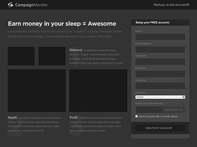
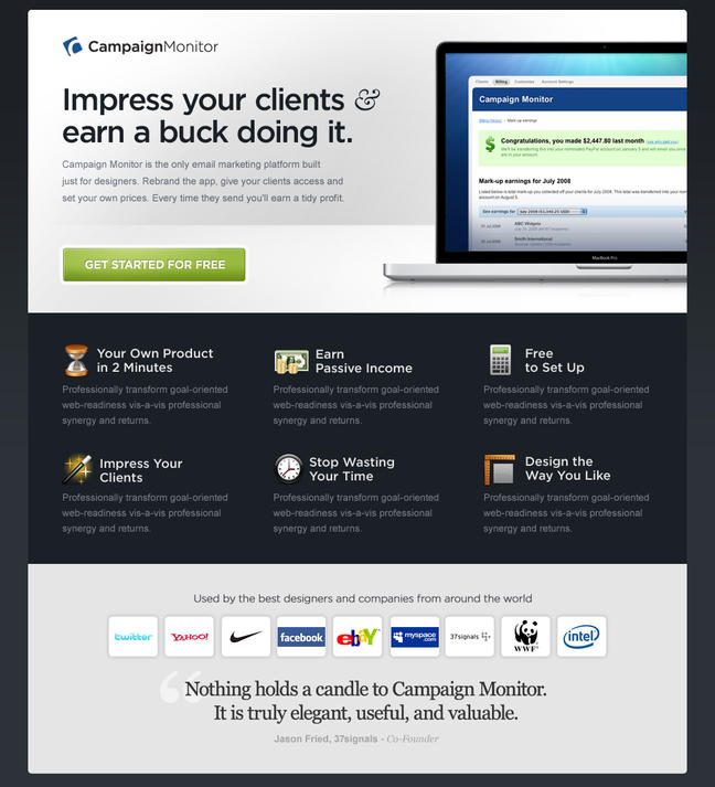
Focus 1: Markup, Re-sell and Profit

When designing landing pages, it’s great to be able to sum up everything in a few points. So it seemed great to me that there are three big callouts here: Rebrand. Resell. Profit.

Those three callouts drove a lot of this initial wireframe concept.

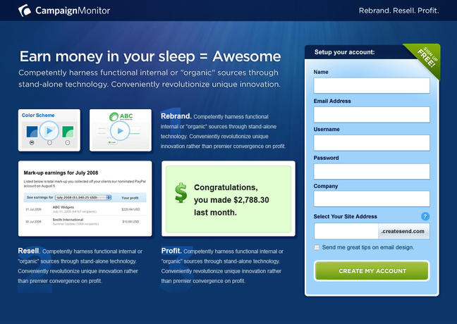
After applying the design elements to the wireframe, the layout quickly became too busy. In the wireframe, the flow is more obvious. But in the design, the numbers are removed and colors are added which allowed the feature area to become confusing.

We decided to take a more linear approach to the feature well.

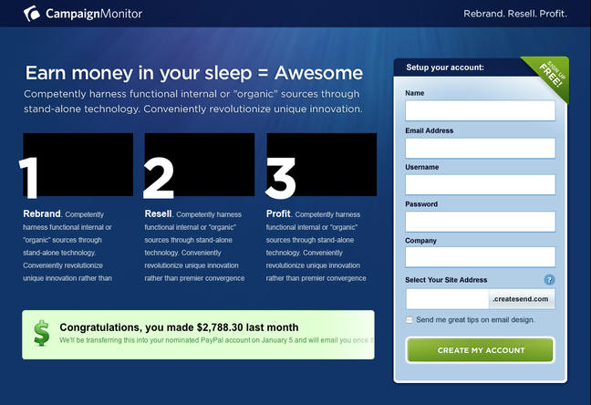
It felt better, but the feature area still needed to be simplified. We removed the 3 images above each step and replaced them with icons. This really cleaned up content quite a bit.

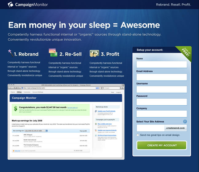
The next problem was that our callout copy was now touching the header text. Too much text together created some confusion, so we moved the big image between the header and the callouts. This, along with some color tweaks and spacing, led us to the final design.

Focus 2: Email Marketing Just for Designers

The second landing page is focused specifically on designers, so we wanted to do something completely different from the existing brand. This approach is intended to build curiosity and hopefully is intriguing enough to warrant digging a little deeper.

In addition to the unique design, Dave wanted to try something a little risky on this one. By presenting the user with a modal window asking the question, “Are You a Designer?”, we are essentially communicating Campaign Monitor’s complete focus on the design community.

This design comes out relatively quickly, with slight iterations on the initial concept until the final was complete.

We really wanted to go with that fresh, slick Apple-like approach to the design.

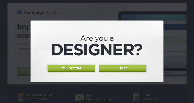
The modal window incorporates large typography and resides on a slightly transparent background.

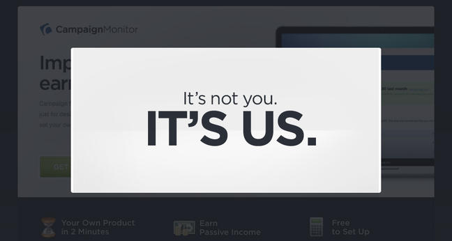
When answering “Nope,” you are sent off to the competition. A gamble to be sure, but as Robert Frost once said, “I took the one less traveled by, And that has made all the difference.” And, in fact, it did make all the difference. This version with the modal ended up having the highest conversion rate at around 4.5%.

Conclusion

All in all this was an excellent study in the landing page best practices. When conversion is the name of the game and you have so much you would like to communicate, it really comes down to achieving a simple, yet strong concept that is clear enough to understand immediately. You also have to be obsessive about creating a clear path to the call to action, removing unnecessary elements, and staying as focused as possible. Each piece should be doing its share of the selling.

So how did all this turn out? Well, because of Campaign Monitor’s business model, the true ROI will be a work-in-progress. But Dave just posted some really interesting details on the Campaign Monitor blog covering which banners (designed by Newism) and landing pages performed best, and which ad networks achieved the highest conversions. You can read about it here

Comments

Straight to the point, easy to read, shows how it benefits you. You make it look so simple.

Well done!

Dave Ruiz - June 03, 2009

Something else that impressed me about these designs was the lack of a hard sell. There’s no screaming ‘BUY NOW!’. Just the confidence that product is solid, portrayed succinctly. Great work.

Wayde Christie - June 03, 2009

Nicely done, it has a subtle approach as Wayde said, but still very effective and straight to the point.

Chris Robinson - June 04, 2009

Jesse, first and foremost, great designs! But looking at your other work, that’s nothing new!

After reading Campaign Monitor’s post about results thus far, I’m not as surprised that your ‘module window’ design has performed best. This design forces users to interact with the site even if they’re not going to become a CM customer. Nicely done!

Ted Goas - June 15, 2009

Jesse, I love your work! I’m curious though. I’m shopping around for wireframe solutions, found the perfect one but it’s still in development (Axure for Mac). What did you use for your Campaign Monitor wireframe? I really loved how clean it is.

Manon - June 16, 2009

@Ted… you can tip your hat to Brad Haynes for the designs… he worked with me on this one.

@Manon.. I think Brad just used Illustrator or Photoshop for this. It wasn’t a very complex page, so it didn’t really need something as dedicated as axure.

Jesse - June 16, 2009

I keep coming back because of these gems. There’s nothing more helpful than real examples, thinking and choices. Love the evolution of the design and end result. Thanks for sharing.

Andrew M - June 27, 2009

Love the font! What did you use for Are You a Designer?
So clean.

Michele Jackson - June 28, 2009

Brilliant, clean, and everything you need, nothing you don’t. I also just read your article over a Newism regarding the design process for the new Campaign Monitor site. It’s great to see another designers process. I can’t get enough at how clean and tight your design comps are. If you don’t mind me asking, how long was the design process?

Thanks for sharing your thought, it’s always a great read.

Josh - July 16, 2009

Hi Jesse,

very insightful design process. Your work always inspiring and you make the web a much better place.

Just one question, would you mind doing a tutorial on some of the processes you do in Photoshop?

or a web design tutorial! ;D

Ta

Rodney - July 17, 2009

You’re one of my favorite designer. Veru clean and superb.

Joefrey Mahusay - July 19, 2009

You’re one of my favorite designer. Very clean and superb.

Great work!

Joefrey Mahusay - July 19, 2009

gratulation become very beautiful!! Greetings from GERMANY

Auslandskrankenversicherung - July 22, 2009

Nicely done, congratulation!!:
my motto:Mountains never meet, people always

botschaften - July 23, 2009

you are a wonderful design, ideas for your family website are really great. enjoy your family.

tom - July 25, 2009

OK, maybe this is a dumb question, but when the visitor clicks “Nope” they get diverted to a list of e-mail campaign sites. Why would Campaign Monitor do that instead of directing them to e-mail products developed by Campaigtn Monitor’s own clients? Seems like a win-win-win to me, and a good way to say thanks to your designers.

Tim Johnson - July 30, 2009

Thanks, great design, and take care for your family Beste regards from “Reiseversicherung”

reiseversicherung - August 02, 2009

Love your wireframes, so clean. And the end result is superb. Thanks for sharing.

Mihael Locke - August 19, 2009

You’re one of my favorite designer.
thns and have a nice time

prowista - August 24, 2009

very simple very clean
its best design work
best wishes form germay
namensschilder shop

namensschilder - August 25, 2009

Really great to see behind the scenes of amazing work like this. To be able to read the thought process and feel like you are part of the design. Love what you’re doing. Keep it up.

Chad Engle - November 11, 2009

I love Campaign Monitor! It the most elegantly designed email marketing software available – not only that it works really well. I love the ability to skin it – have a look at the Red Bilby login page: https://redbilby.createsend.com/login.aspx

Thanks for a sensational piece of design. Really interesting to read about the process.

Mike Chanter - November 11, 2009

Commenting is not available in this weblog entry.

Authentic Jobs

authentic jobs signHelp Wanted
Recent openings posted at Authentic Jobs.

Post your own job opening.

Recommended

Engine Hosting EngineHosting
Load-balanced hosting solutions optimized for dynamically driven web sites and applications.

ref_apollo Apollo Project Management
Using Apollo, you will realise that it's built to help you get things done, quickly and efficiently.

ref_ee ExpressionEngine
A content management system that allows PHP illiterate folks like myself to create dynamic sites.